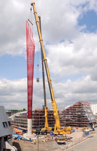
MAKE architects have just completed the UK's largest public sculpture, which is 60m high, and sits in the new Jubilee campus of Nottingham University (the same university that doesn't mind students being arrested and held for a week without charge, don't forget).
The sculpture has a number of traits that make it exemplary of contemporary public art, or 'culture architecture'.
It has a symbolic height.
As seen in projects such as Danny Libeskind's 'Freedom Tower', the symbolic height (or the symbolic angle, or symbolic line, or symbolic shadow, or symbolic cladding etc...) is a feature of contemporary architecture that only exists within the P.R. space of the work. People are generally not good judges of exactly how high something is, so the significant height is only useful if there's a plaque beneath the object, telling you exactly how the work is to be interpreted. It is however useful in a presentation to the client or the planners, who have to make a decision between various different flavours of the same architectural shit. There's a definite cultural aversion to the idea that the viewer/user might be able to use their imagination and make their own associations and connections with an object in space, for example, the Jewish Museum in Berlin is festooned with cards and panels telling you exactly what the uncomfortably sloping floor is supposed to remind you of, and what you should be thinking about that. This is fair enough for Libeskind and a building of such cultural weight, but on the other hand, the Scottish Parliament in Edinburgh has exactly the same issues, which goes a long way to ruining the experience of what is a building deeply concerned with the imaginative response of the user, with someone constantly informing you that "we believe that Enric Miralles was thinking about shortbread when he designed that bench over there, and those light fittings, we think, represent a haggis". This corporate symbolism is everywhere - cladding materials that 'represent' the absent industry of a site, everything has to represent some kind of 'value'. Even in this current project, MAKE talk about 'the theme of nature being drawn through the site', primarily because there are two ponds nearby. This method of minimal 'referentiality' should be compared to the naively heroic abstraction of postwar public art and architecture, with the positive universality of their solutions, and should be seen as an entirely vacuous gesture of lending what are negatively generic solutions the veneer of a contextual relationship.
It is the tallest sculpture in the UK.
Until the next one is built, that is. In fact, there is a hilarious page on the website devoted to the project which allows you to compare the size of the sculpture against a series of (smaller) sculptures from across the world. It's not as big as this though.
It's 'iconic'.
And we all know what that means.
It is funded privately, rather than by the university or the state.
In fact, in a hilarious return of Victorian values, it's been funded by an anonymous philanthropist.
It is called 'Aspire'.
Now this is not just appallingly bad nu-speak, but it's a vile pun that takes on even more of a stench considering it was chosen in a public vote of students and staff at the university. The sculpture sits in a campus that is home to computing, education and business studies, (probably soon having a department of studies studies I imagine), and the name, rather than evoking some noble human spirit of endeavour and self-betterment, is actually much more like a barked ideological order - like ENJOY in the millenium dome, the spatial imperative is to ASPIRE! WANT! ACHIEVE! GET!
It's only fitting that what is essentially a very large, shiny column that supports nothing is considered the best physical evocation of the spirit of contemporary higher education.

5 comments:
after reading Fredric Jameson on the architecture of financialisation, the 'aspire' seems not only to belong to his analysis of overconnotation and empty spirituality but also to unforunately recall a large pin about to burst the current fiscal bubble...
Interestingly, much like a threatening iceberg, 85% of 'The Prick' (as it ought to have been named) is underground.
reading Fredric Jameson on the architecture of financialisation
where?
The essays are in The Cultural Turn, one called 'The Brick and the Balloon' (also available in NLR I/2228 (1998)) and the other title escapes me (last two essays). They are an attempt to map an aesthetic of financialisation along similar lines to the postmodernism material.
In fact it looks more like a cup holder for a bubble / pin pong ball
Post a Comment