'Summerland' was an indoor entertainment complex in Douglas, the Isle of Man, which on the evening of the 28th June 1973 suffered a massive fire which killed 50 people. The fire was started accidentally by a group of children who were hiding outside smoking, with a discarded cigarette causing a small fire that made its way into the exterior walls of the building. This fire grew, out of sight, before breaking out into the main hall, and within minutes the entire building was ablaze, with 3,000 people hysterically clambering over each other to escape.
The disaster was in many ways similar to other tragedies of its type - visitors were unaware of escape routes, while some of the doors had been locked shut by the management as a way to prevent people from sneaking in without paying. There was also a delay in the evacuation of the building, which didn't begin until the fire had already engulfed the interior - in addition to this, the fire brigade were not called for almost half an hour after the fire started due to poor safety training of the staff. In a subsequent enquiry these were the most significant factors in determining why there had been such loss of life.
But there were other significant failings - ones which inevitably damaged the reputation of architects and engineers. One of these was genuine, and serious; the internal layout and the means of escape in the building were wholly inadequate for a building of its type, with a single large open staircase the only obvious route down; this staircase was overwhelmed during the escape, and half of the bodies of victims that were later found were on this staircase.
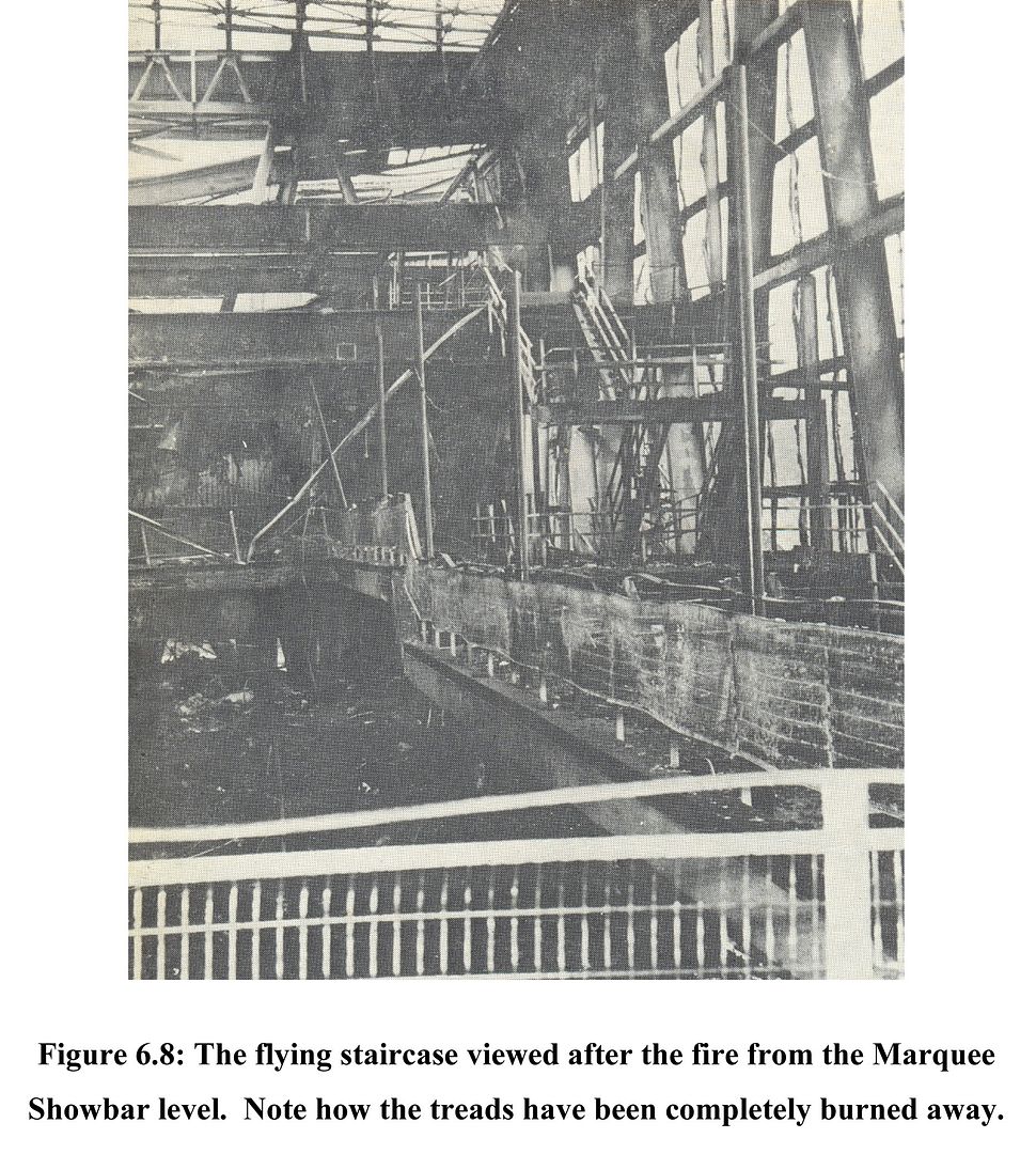

Furthermore, and in a development that brings to mind John Poulson and the image of the brown envelope-handling poltician and architect, there was a blatant flouting of the normal building regulations. The external wall that the fire started below was built from 'galbestos', an un-fire rated panelling material, chosen to save money - it was suggested that if it had been concrete then the fire would not have spread. The 'oroglas' transparent acrylic that was used for the façade and roof was known to be flammable, but somehow during the design process the architects managed to get a waiver for the material, relying on manufacturer's claims that when heated the material would soften and simply pop out of its frame, an untested supposition. During the disaster, the oroglas ignited rapidly, greatly increasing the ferocity of the fire, and causing molten plastic to drip down onto those desperately trying to escape. In the immediate aftermath of the disaster the press developed a narrative whereby this untested and dangerous material was a major contributing factor to the disaster, and although this was later shown to be mostly untrue (the oroglas ignited late in the conflagration, and it was later realised that most if not all of the casualties had already occurred by then), the narrative of the modernist architect foisting a dangerous and untested material onto an unsuspecting and vulnerable public was a dramatic one, and one that seeded itself in the distrust of modern architecture that would fully develop in the following decade.
But beyond the horrible events of that day, the Summerland building is a remarkable building as well, both in terms of its functions but also its position within a historical context. It deserves to be studied, certainly not as a work of architecture of any note, but as an early attempt at actually building a radically new idea of the time. Outside of the tragedy itself and the historical effect it would have, the Summerland building was unique.
The decision to build Summerland was born out of demographic trends in the 1960s - the generally increasing standard of living meant that more people were taking foreign holidays, and often for the first time this included the working classes. Douglas on the Isle of Man was a traditional summer holiday destination, but it was moving into decline as the 60s wore on - it had pretty average weather and a lack of facilities or entertainment venues. The solution that was put forward by the government of the island was for a modern leisure complex to be created that would encourage tourists back to the island again. An architectural competition was held with a very vague brief (basically; "a swimming pool and whatever else you think might be useful"), which was won by a local architect, James Phillips Lomas, who presented a remarkably avant-garde design.
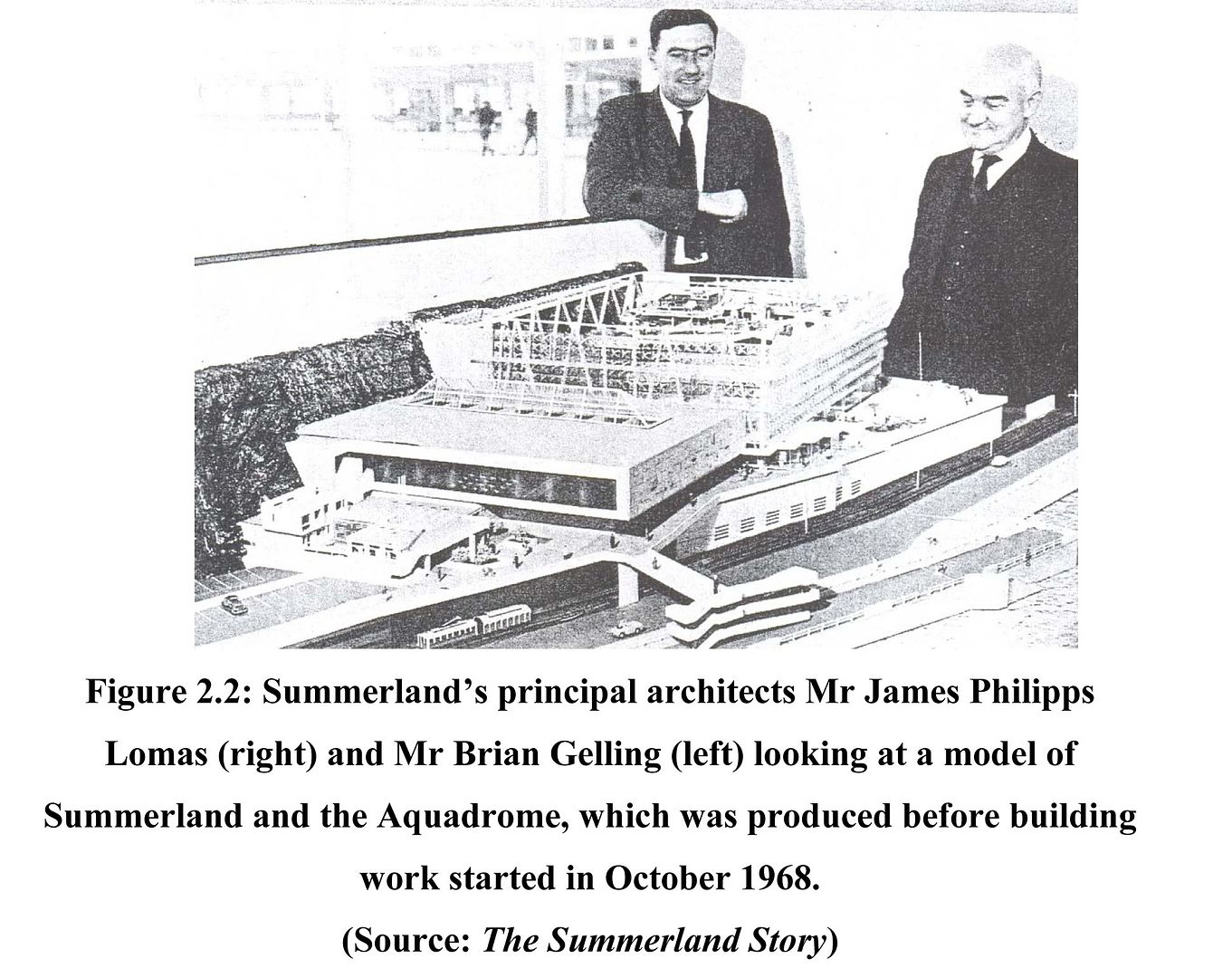

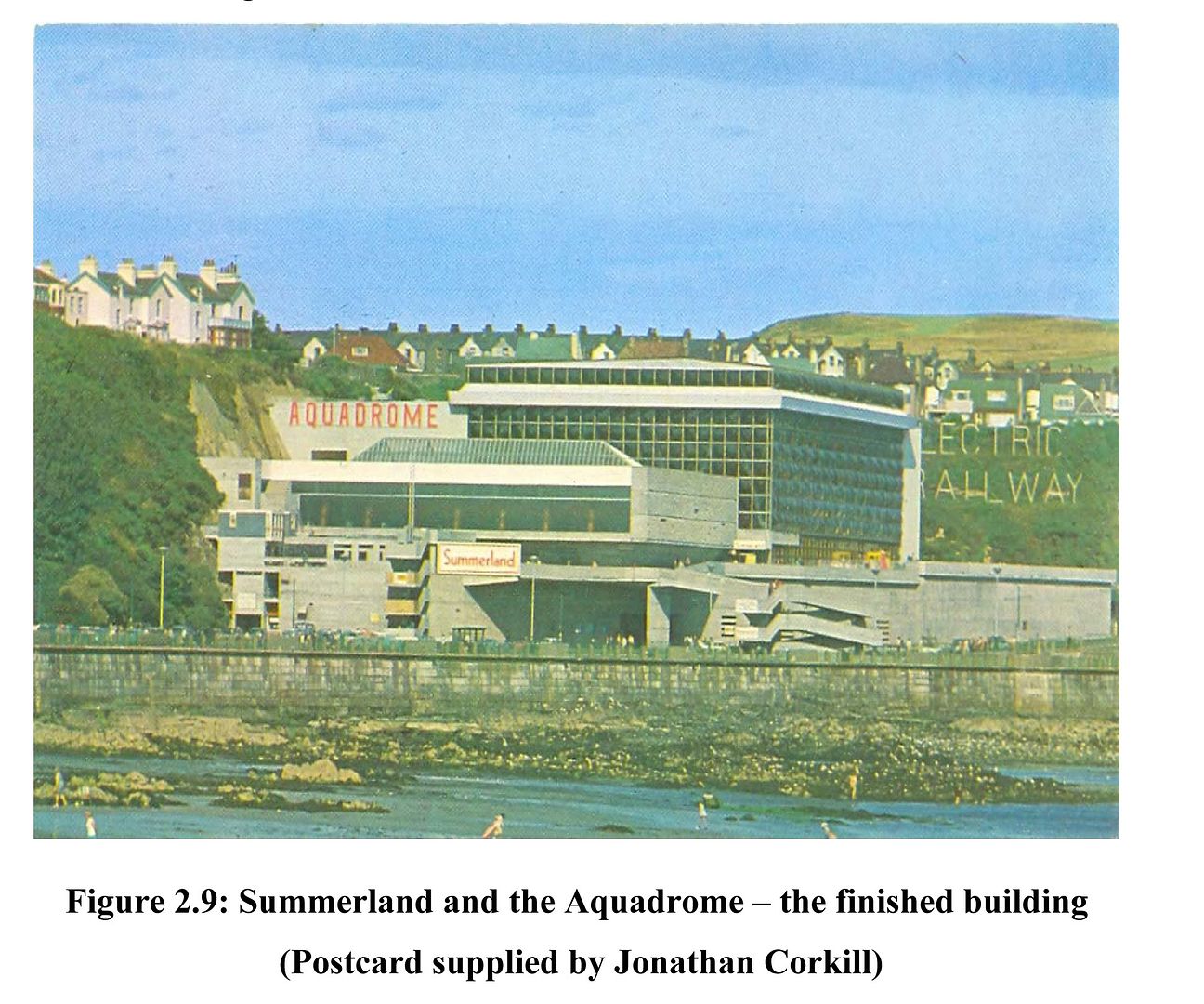
The proposal for Summerland basically consisted of two main phases; one was an Olympic-size swimming pool complex entitled the 'Aquadrome' and the other, 'Summerland' proper, was a massive single enclosed space into which all manner of entertainment programme was to be inserted. With a footprint of about the size of a football field, and a single 30m high roof, it was a huge, singular air-conditioned environment, designed to create a pleasant microclimate throughout the year no matter what the weather, its vastness giving the impression that it the visitor was actually outside on a wonderful summer day. The space was supported on a large truss of steel columns, with a space frame roof spanning across the top, and into this structure were inserted the oroglas panels, chosen over glass for their strength, their lightness and their ability to control solar gain.
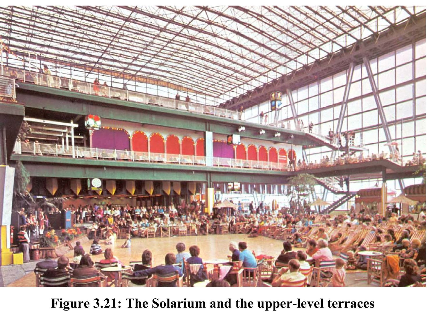
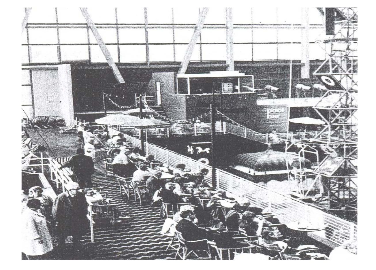
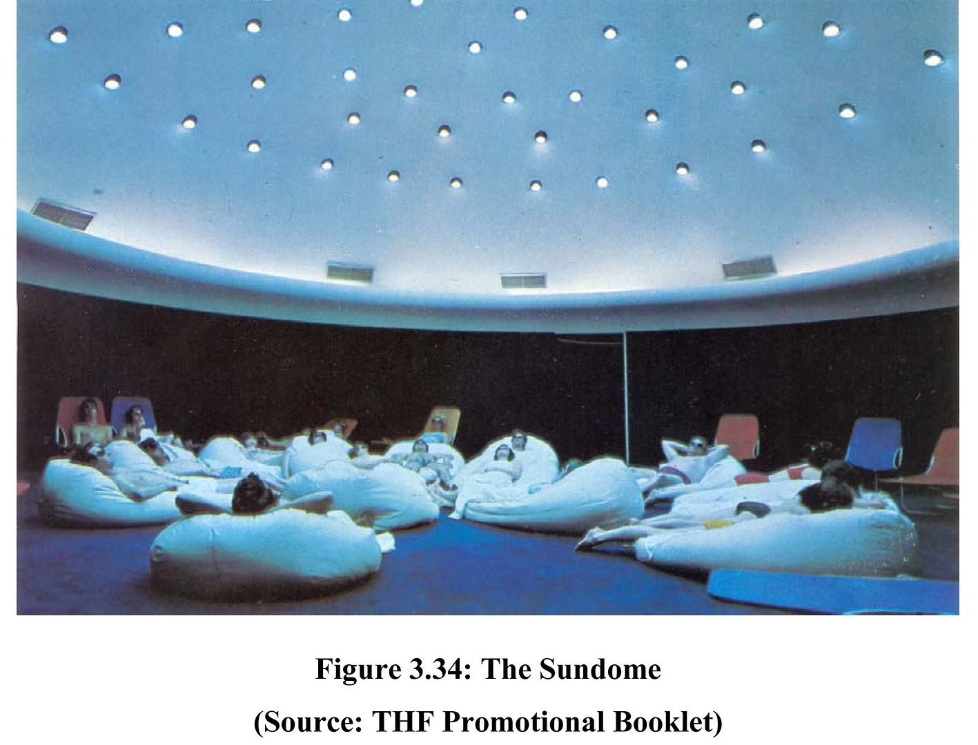


Summerland was designed to offer the visitor absolutely everything that they could get from, for example, a Spanish holiday resort. Into the cavernous greenhouse were built a number of terraces, with programme including an amusement arcade, a restaurant, a number of bars and a futuristic tanning room called the 'sundome'. Underneath the solarium were children's entertainment and amusements, and a basement disco. In total the building was capable of holding 10,000 visitors at any one time, a rather huge amount of people to be freely moving around in just the one complex. The interior was kitted out with a very strange array of styles, from the deck chairs and stripy canopies associated with the Great British Seaside, to the 'timber Helvetica moderne' interior style that was common at the time, to the total kitsch of the interior waterfall and 'rustic walkway' made of logs, to the crazy high-tech communications tower, and the plastic tat of the bingo hall.
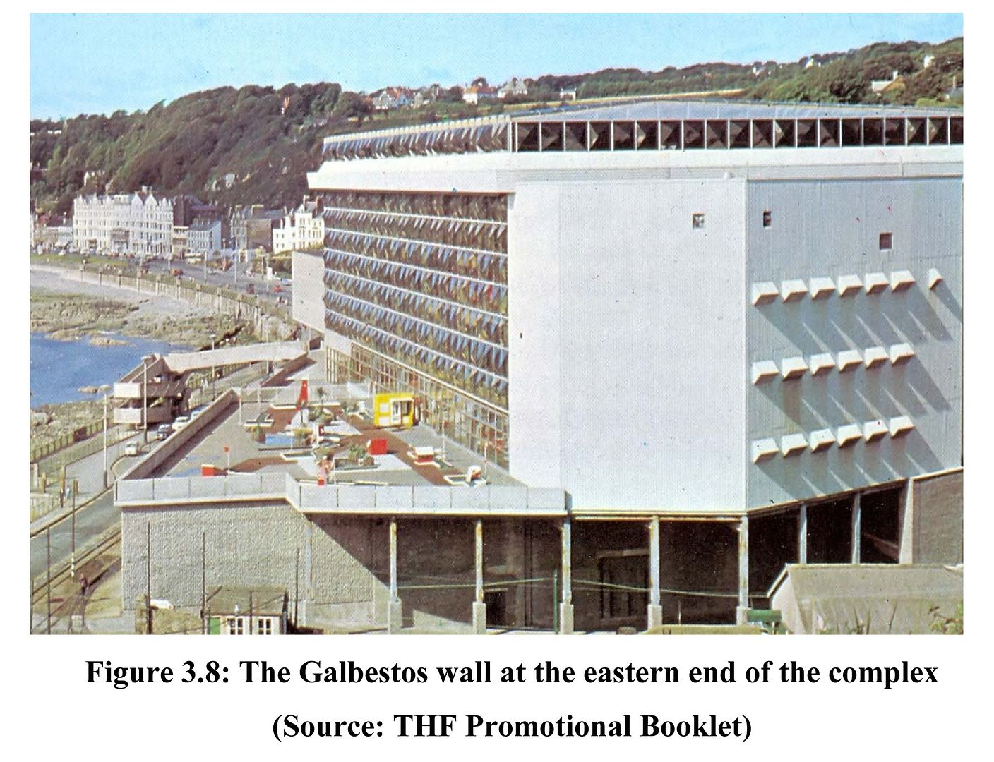
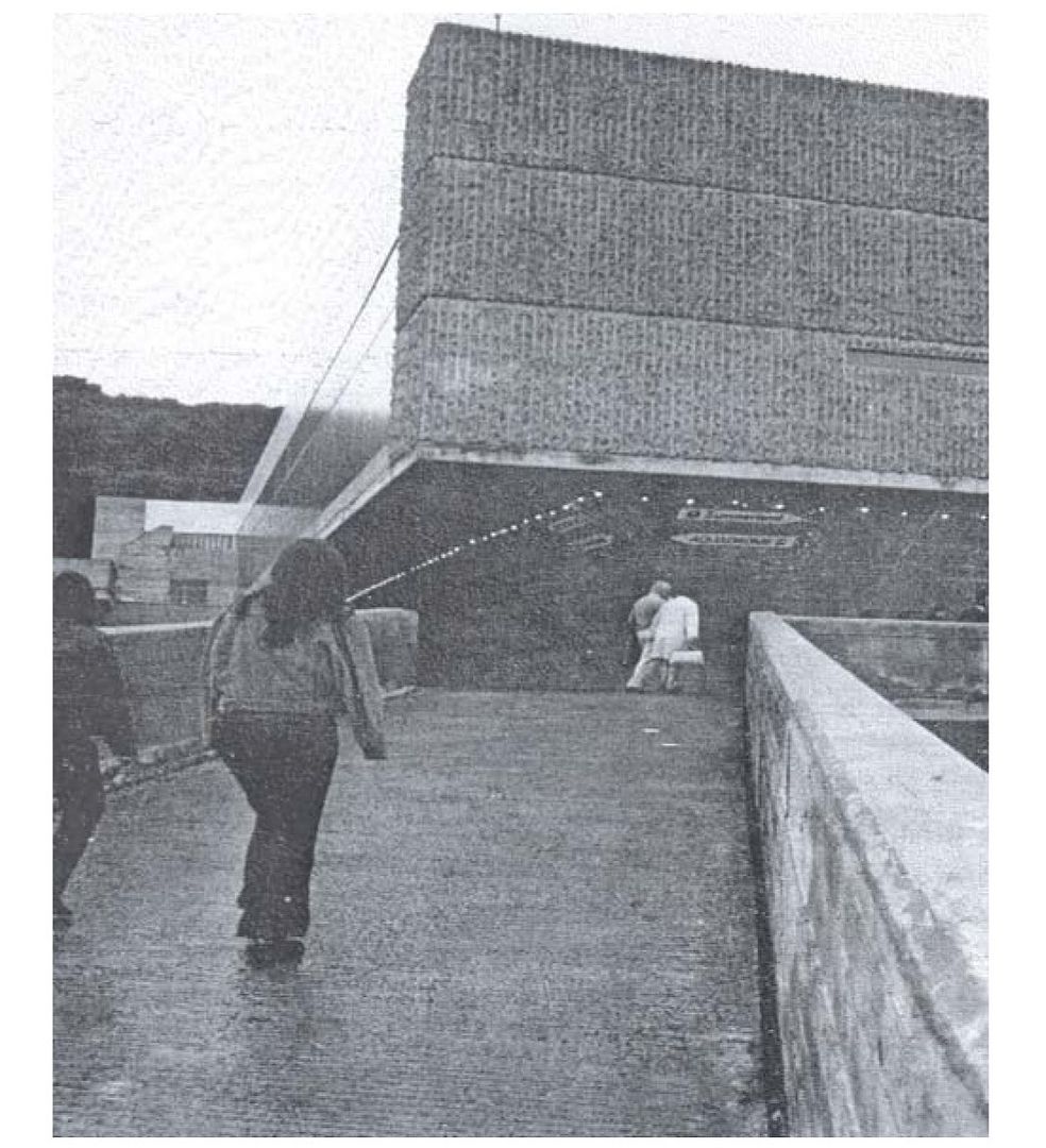
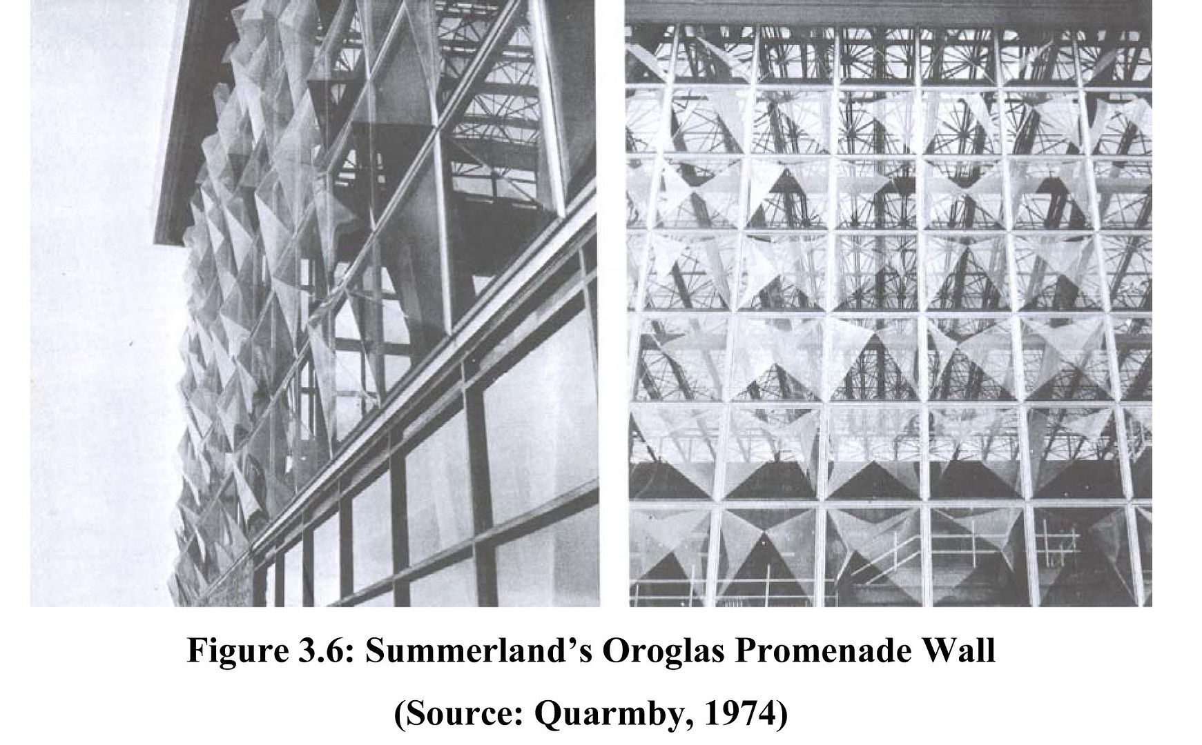


At the architectural scale the building represented a strange hybrid, a transitional architecture stretching forward but unable to escape its own time. The majority of the building was constructed in a rather unsophisticated brutalist manner - the swimming pool and the lower storeys of the solarium were almost entirely windowless concrete lumps, with none of the flair of a Rodney Gordon, another architect operating at the same time at the similar end of the commercial scale, and yet capable of magnificently bold and clever designs. The solarium, however, is an embryonic example of the architecture that hadn’t yet managed to make itself felt as 'high-tech', the steel and glass mode that has now taken over the world; the solarium was spare, structural, it receded in a way that concrete doesn't. It was an example of architecture as attempted dematerialisation.
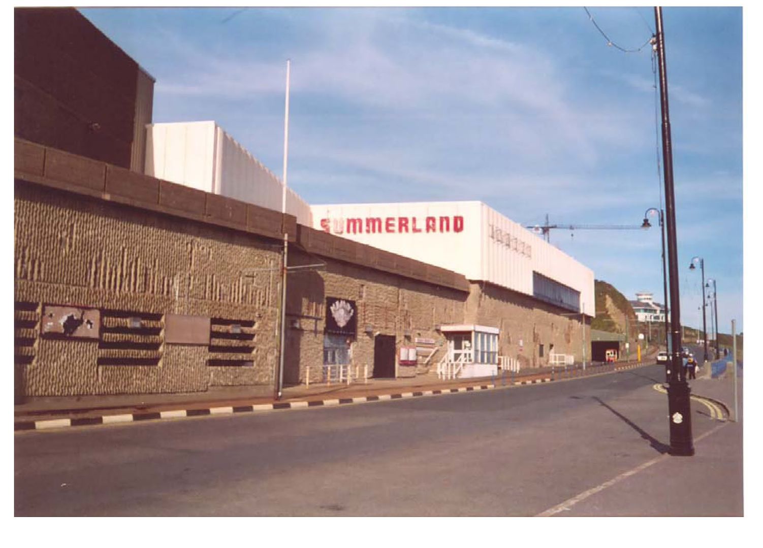
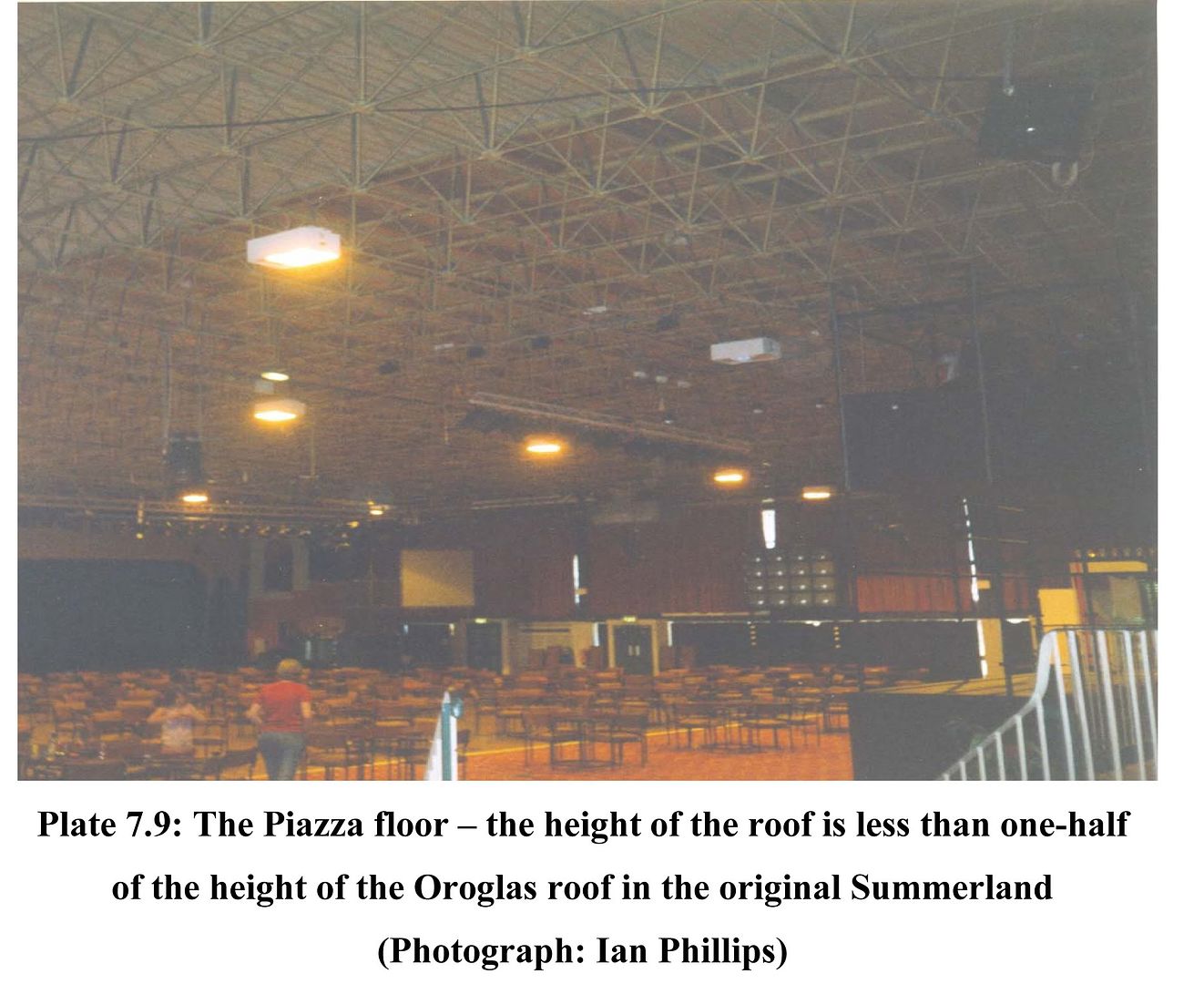
After the fire, it is really rather astonishing that Summerland was not immediately demolished, considering the horrors that had occurred there, but it was decided to rebuild the complex in a less risky and ambitious fashion. The swimming pool had suffered comparatively little damage from the fire, as did the concrete floors underneath the solarium. Instead of the massive airy enclosure however, the replacement was a single storey box with barely any windows to the side, supported under a gloomy space-frame roof. The pedestrian bridge across the road was sliced off, and the concrete facing the sea rotted away to the reinforcements, leaving the building looking about as sorry as it was possible for a building of that period to really appear. Although apparently still valued by locals, the new, diminished Summerland never managed to maintain profitability, and it was eventually demolished in 2005.
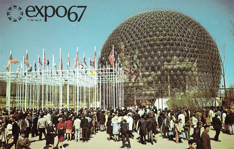
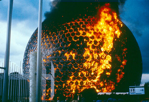
There are a number of resemblances that I'd like to point out here. The first is a rather uncanny one; the USA pavilion at the Montreal Expo, 1967. On a superficial level, Buckminster Fuller's geodesic dome has two major resonances with Summerland - the dome of the expo building was not only entirely clad in oroglas, but it too was consumed by fire, although without any loss of life. But furthermore, both of these structures were attempts to create massive interior, climate controlled and hospitable spaces for activities within. This was very much part of the utopian culture at the time, with the prospect of moon bases and the rise of the consideration of architecture in terms of serviced space rather than form and void - Banham's 'Architecture of the Well-Tempered Environment' was published in 1969, for example. Indeed, it was said that the original concept for Summerland was actually a dome but was lost to cost and construction difficulties - this would seem to be borne out by Lomas' other design for a leisure complex in Hunstanton which looks rather like an early sketch for the Eden Project.
But Buckminster Fuller's Biodome was a pavilion of science and lofty thinking, whereas Summerland was entirely an entertainment complex. With this in mind, then perhaps the greatest resonance is with Archigram. The gee-whizz consumerism of Archigram's Zoom ethos was remarkably congruent with the high-tech British seaside resort that was Summerland (even if Warren Chalk gave a patronising review of Summerland in the AJ, calling it a 'rather timid collage'); both had the same emphasis on colour, fun and consumption and the apparent freedoms that they entail. But whereas Archigram's dreams were conjured up by a group of professional men, at least some of whom were of the 'upper orders', and were populated by models and starlets, Summerland was pitched directly at the ordinary worker and their idea of a fun holiday. Furthermore - the great project of Archigram, the one that got away, was indeed a single-purpose entertainment venue, by the sea, contained in a large, continuous single serviced space, although this time it was to be built in Monaco (of course!). In this case what Summerland represents is a genuine, actually existing example of what an 'applied Archigram' would turn out to be; a concrete test of the flash-whizzy dreams of architects applied to genuine working class lives, which in this case was a fully-sealed space for children's talent shows (although it should be noted that until the disaster, Summerland was making a tidy profit). The point here is that Summerland as an idea was no less ambitious than an Archigram event-space, inasmuch as Summerland was genuinely built, genuinely used and genuinely enjoyed, rather than merely pamphleted into academia.
Finally, we can go yet further back, and here it becomes rather clear quite why I have become so interested Summerland: there is another historical building, one which synthesises the two oroglas vitrines, Fuller's and Lomas'. I am referring of course to the Crystal Palace at Sydenham. Here, a single seemingly immaterial interior space of a genuinely unprecedented scale was erected in 1854, with lofty ideals of education and optimism. Again, inside this envelope (or sphere, if you fancy a spot of Sloterdijk) were strewn a varied and shifting set of architectural spaces, styles and programmes. Again, the building was an attempt to create a moderated interior environment that would be akin to a constantly pleasant outdoors. However despite the ideals of its founders that it would be a place where the classes would mix, by the turn of the 20th century it was looked down upon as a place only frequented by the aspirational petit-bourgeoisie, with entertainments and exhibits of a rather kitsch variety. And of course eventually it too would burn down.
So beyond merely representing yet another end-point of modernism in architecture, when the negligence and incompetence of its practitioners were laid bare in the most appalling fashion, Summerland actually has a deeper resonance with the architecture of modernity; it is part of the modernism of disappearance, of traceless architecture that recedes behind pure activity and space, of environments defined by freedom. Despite its brashness, and despite the fact that even without the fire and tragedy it would probably still eventually have been a failure, Summerland was fascinating for being a genuine attempt to realise some of the dreams of its time.
 |
| Level 4 plan of Summerland (note - numbers in bold symbols represent where bodies were recovered) |
 |
| Level 5 plan |
 |
| Level 6 plan |
 |
| Level 7 plan |
Note:- This post was greatly helped by a study of the disaster written by Ian Phillips.




3 comments:
Lovely piece Douglas. Really interesting. It could have gone nicely in Icon 102 "FIRE", pity our thinking wasn't joined-up enough.
The flawed thinking around the staircase put me in mind of this other modernist engineering disaster:
http://en.wikipedia.org/wiki/Hyatt_Regency_walkway_collapse
Damn. Whoops, that would have been good.
Thanks for the kind words as well...
Thanks, that was great, facinating stuff! It makes me wonder if there wasn't a particular 'death' of modernism in my local(South Africa) context.
Post a Comment