First- a rather inconclusive and rambling article about 'doily-tecture' or 'neo-pomo', or 'cyberoque' or whatever you want to call it.
by yours truly in icon, only in print I'm afraid...
As usual I'm trying to make a number of points at once, and thus making no real point at all. I'm well aware of the banality of trying to claim that there is something novel in any 'return to ornament', of which there has been one in each of the last four decades, but I suppose that with this piece I'm trying to begin to put things into a certain historical context; with the thesis being that there is a distinct sense of eclecticist deck chair shuffling going on in the aesthetic indulgences of some academic architecture at the moment, and that this will only disseminate outwards in a vulgar and demeaning manner, no matter how intelligent the initial protagonists are. This is something that I want to unpack at greater length soon, but in the meantime please read the piece and don't be too mean about it.

Second - Olympics produces good building shocker!
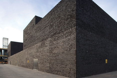
This little bad boy, visible from the train between Hackney and Stratford, shows how easy and how powerful a little bit of 'real architecture' can be, and is likely to end up being the only worthwhile building to come out of the olympics. Ellis Woodman's little paean to the simple black brick box got people chatting, with some being charitable, some less than charitable. For what it's worth, it's a clever idea, executed well, and shows an intelligence that is very sadly lacking from anything else nearby (do I see Plečnik in there?). I'm not about to make a plea for 'background architecture', but it is 'Good', and that's about as much as we can hope for these days. What I also like about it is some of the chat that Alan Pert from NORD gave BD:
The Substation wraps around the internal pieces of infrastructure, it is a structure scaled not to its context but in relation to its purpose. The height, width and length of the structure is modulated as a direct reflection of the objects held within. The formal resolution is therefore a mere consequence of the requirement of the structure to contain equipment. There is no formal agenda, it is not aspirational, and it makes no attempt to connect to the city through scale or language. Rather it expresses a kind melancholy acceptance of its place in the city.
or:
The brickwork skin is either solid or perforated according to the need to contain or let air pass. The brick is not just an enveloping surface to the building; it is variously surface, skin, load-bearing structure, veneer, roofscape and landscape. It refers to the context of utility structures within the city of London through the use of brick, as it's homogenous skin. Those magnificent 19th century structures adopted the language of the city to place themselves side by side with the Victorian urban and utopian social ideal in the form of the factory, school and hospital. The Substation however responds to a different context, post industrial and post utopian. No longer aspirational as the Victorian models were, the Substation expresses a quiet acceptance of the world.
Nice: Defeatist architecture, something I can really get behind.
ps - Does anybody know of quietly subversive utility buildings other than this and Outram's Pumping Station? It would be good to collate a wee list.

Third - This quite frankly bizarre article.
Rory Olcayto seems to have decided that everyone is being a little unfair to cheap-as-shit-blatcherite-aspirational-class-cleansing-city-killing-pseudomodernist-yuppiedromes, and so has decided that they needed some mature analysis. Rather than calling them by their rightful titles, he's opted for the term 'Cabe-ism':
England has a new mode of architectural expression. It’s called Cabe-ism (by me, at least) and has taken ten years to perfect. It draws upon many sources: Gordon Cullen’s Townscape philosophies, Ian Sinclair’s psychogeographic musings, public-private (usually develop-led) ideas about brownfield regeneration and transparent decision-making inspired by New Labour.
Throw in a bit of old-fashioned modernism, concern around climate change and some mixed-messages about ‘iconic’ design. Finally, sprinke liberally with branding concepts culled from 80s-style advertising culture, and what you have is Cabe-ism.
I think this must be satire; I mean, he couldn't possibly be serious, could he? He does at least mention some of the aspects of 'Cabe-ism' that are so horrible, but he takes a strange, detached, 'ho-hum' attitude to them, rather than the splenetic despair of the architectural critics that I am more familiar with. The point where my credulity is snapped is the passage where he congratulates the architect for being able to use so many materials at once, which is surely damnation by faint praise.

1 comment:
What I've discovered since beginning to work in the UK is that Cabe-ism (or whatever you want to call it) seems to be written into the processes and regulations that must be followed to get many projects approved (especially if they are getting govt funding). Endlessly frustrating to say the least. Many architects have internalised these strategies to the point where they seem like good ideas: timber slats? check. multi-coloured glass? check. etc.
Post a Comment