Wednesday, 28 October 2009
Nouvel Différance
It’s a bit of a truism that most architects of a certain age have a bit of pastiche pomo in their closet, and in a way this often makes the appreciation of their other works a bit suspect. Take Jim Stirling as an example here. The fact that he ended up making No.1 Poultry retroactively puts a bad taste in your mouth when you’re marvelling at the ridiculously refined staircase details of the Florey building in Oxford. The point here is that you often realise that an architect was only ever following orders, despite how much virtuosity they might have followed them with. If there is a project to reinvigorate the polemic power that was a part of modernism, we have to accept that there are always those who do what they’re told no matter who’s telling them.
Now, regarding closeted skeletons, it has to be said that postmodernism is - to make a ridiculously ironic understatement - something that the French have always done well. I recently pointed out a pomo-bridge design by Francois Soler, an extreme example of the latent expressionism of engineering structures, a sort of hybrid pomo-tech. Jean Nouvel also had a habit of designing buildings in this manner, his Institute du Monde Arabe with its photovoltaic mashrabiya screen being a good example. But I found a really interesting little skeleton in his closet from 1984; a deconstructivist skeleton, no less.
I think decon suffered greatly from the interference of Philip Johnson, a recurring theme in the 20th century. Compared with his aestheticisation of the ‘International Style’, what happened to decon after it was passed through his hands was not a depoliticisation, but rather a de-intellectualisation (although – decon architecture’s intellectual credentials are never entirely credible). Dumbing it down into issues of shape is less of a hatchet job of course, but it’s still a disservice which led easily into wanton formalism and very much assisted in decon’s eventual metamorphosis into the ‘iconic’ building.
Decon as a method was always far more interesting and successful when it had to deal with a rich site; Eisenman’s excavatory projects are more interesting than his pure-formalist projects for example, and Bernard Tschumi had some great ideas that were only ruined by them having to have been built in the 1980s. Nouvel’s Belfort Theatre, completed in 1984, would appear to be a good example of decon in its more challenging and satisfying variant.
Effectively a renovation/extension, the theatre contains some stock decon tropes; Nouvel plays two local geometries off of each other, setting architectural features at seemingly strange angles from the volume of which they are elements. A grid of lightweight structure is added to one façade, running through the windows and off at the ends. Certain aspects of the previous buildings are retained in various ways inamongst the new structure, creating a collage effect that the best decon sought to achieve. There are other features that Nouvel uses here though that I’ve not seen anywhere else. He had workmen go at some of the previously badly renovated facades with a jack-hammer, creating patterns with the revealed brickwork underneath them. He even went so far - and this is where decon spoils itself by becoming an architectural parlour game – as to have ‘hatching’ hammered into walls that appear to have been truncated, and to have the profile of the concrete floor projecting beyond the walls. These mannerist in-jokes combine with the grid try to make the building into a technical section drawing of itself. Other over the top aspects are the half windows onto nothing, and it must be said that there are some typically embarrassing bits of 80s detailing here and there. But overall it’s an interesting building, thankfully without the floating trapezoidal forms or wonky pilotis that would be the only things that decon qua architectural method would carry forward to the 90s and beyond.
But this saturated-site approach didn’t necessarily disappear. Some of the work of EMBT, for example, was capable of creating resonant juxtapositions of old, new and quasi-old elements, with an attitude that while not necessarily theoretical, was intelligent and self assured, and which had a great sense of ‘specialness’ and bricolage, like a series of posters that have slowly and unevenly been worn away. Their work leaves the more esoteric aspects of decon behind while still being rich with reference to architectural history, both of the contextual and canonical sort.
I think that overall it’s worth noting that there were aspects of the ‘pomo’ project that were serious attempts to create a synthesis of modernism and historically embedded architecture, that at the very least attempted to address the difficulty of creating buildings within an archive of built statements.
Sunday, 25 October 2009
biased bbc etc...
And also, I cannot recommend the following posts related to some tv programme that I definitely did not watch the other night enough:
Anton Vowl's one,
&
K-Punk's one & two.
xavecy
This would be a particularly brutal caricature, yet it nevertheless contains a grain of truth: there is indeed an undeniable respect in which Derrida (along with Heidegger) and to a lesser extent Deleuze (along with Nietzsche) provide the most immediate reference points for understanding Laruelle’s thought, in which the negative characterization of philosophy provides the precondition for the positive creation of ‘non-philosophical’ concepts.Ray Brassier, Nihil Unbound, p.134
This reminds me slightly of that trope of the synthetic construction of new cultural material, common in film (Alien as 'jaws-in-space' etc) and music (xband sound like yband meets zband) and seemingly accelerated or concentrated in the current cultural climate of hyper-information, epitomised by the 'mash-up'.
Ads has an interesting post about this, porn and modernism, and Evan(who with every post makes me embarrassed to be pretending to write at the same time as him) has had a mini-project on this for a while.
I know it's stupid but I quite like the idea of imaginary cultural artifacts defined by their being explicable in terms of a dyadic synthesis. Think of it as perhaps a kind of Borgesian fiction for the internet age, or something banal like that. More seriously I do think it is symptomatic of a greater relinquishing of novelty, for the fallacy "nothing new under the sun" is ever-increasingly taken for granted...
ps- the main reason for this post is to ask if anyone strongly recommends or discourages reading Laruelle. Should I bother investigating? Is it worth the effort? There's an ironically entertaining debate between Derrida and Laruelle that has been translated online, which consists mostly of Derrida raising objections to Laruelle's non-philosophy, to which the response is usually "Aha! You're doing it again!"...
Wednesday, 21 October 2009
A very brief note on arranging.
One of the most common textures in piano music is a slow right hand part with a quicker left hand part, often outlining a self-similar arpeggio whose consistency ties the piece together logically, and whose variation helps to emphasise the harmony of the piece. When arranging piano music of this character for the guitar, there are a few very common problems that occur. I'd like to have a wee look at them, using bars 18-19 of Chopin's Prelude No.3 in G as the basis.
Example 1
This is the original music written as a guitar part (on one stave and written an octave above natural) We're in the sub-dominant region at this point, and in a few bars we'll prepare for and move onto the last cadence. At the moment though, it looks pretty non-sensical when written out this way, we'd need a lot of extra guitar and a few new hands to play it.
Example 2
Often the first step in arranging piano for the guitar is to move one of the hands a whole octave. Depending on whether you're transposing (we're not here), it's usually pretty obvious which hand to move, one usually drops the right hand, but that lowering is somewhat offset by the brighter tone of the guitar. Often various sections of a piece will have to remain and others moved up or down, and that presents its own set of problems. Another thing that is usually helpful is to get rid of doubles, which we've done here, as the low E is not a significant voice in the piece. The problem is; the low C in what was the left hand part is still a major third below the low E of the guitar. We'll have to do something about that.
(ps - the overlapping of the G in the right hand melody with the A and G at the top of the left hand melody is a crack one has to smooth over in performance).
Example 3
Leopold Godowsky's arrangements of Chopin for the left hand only have been invaluable in suggesting ways in which the character of a piece can be preserved even while condensing it drastically. A technique that he is often forced to use is to eliminate the first note of the left hand part, before jumping down to continue the lower melody (see his version of etude 6, op.10). I've also seen Mahler use this left hand rest in arrangements of his own pieces for piano. If you do utilise this approach, the next problem is that you then have a melody whose lowest note is the fifth of the chord, and we don't want this to sound like a 6-4 chord. One advantage is that left hand parts like this are often spread out in the lower register, meaning that you can replace a melody such as C₂,G₂,C₃,G₃... with rest,C₃,E₃,G3... with only a small change in the character of the melody. In this case that isn't possible, so...
Example 4
We reinstate the root, but an octave above. This might be better, but in my opinion this is a rather ugly solution, with the low G still being conspicuous after the root.
Example 5
This is my preferred solution to this particular problem, a quasi-turnaround of a B after the root, creating a more sinuous melodic effect in keeping with the curvaceous feel of the piece. The G at the end of the bar is retained to create a stronger dominant effect.
A very brief note on M.D.
The following short passage might help to contextualise a little of the father-slaying that went on earlier this year:
At this juncture, Badiou can respond in two ways: he can either choose to correct the anti-phenomenological bias of the concept of presentation by supplementing the subtractive ontology of being qua being with a doctrine of appearance and of the ontical consistency of worlds albeit at the risk of lapsing back into some variant of the ontologies of presence. Or he can accept the stringency of his concept of presentation and embrace the prohibitive consequences of the logic of subtraction. The recently published Logiques des mondes (Logics of Worlds) suggests that he has – perhaps reasonably, albeit somewhat disappointingly from our point of view – opted for the former.
-Ray Brassier, Nihil Unbound p.115
I think, perhaps naively, that the appropriate question here is - "why is disenchantment the object?"
We can trace the development of this copernican disenchantment over the last thousand years, we can outline the current vectors of disenchantment, but unless Meillasoux or somebody else can develop his hyper-chaos=noumenon argument into more than a virtuosic curio, then I am yet to be convinced that this push for disenchantment is anything more than a tautological 'we are against phenomenological mysticism because it is mystical'.
Friday, 16 October 2009
Extra! Extra!
A few assorted things from the British architectural press this last week.
First- a rather inconclusive and rambling article about 'doily-tecture' or 'neo-pomo', or 'cyberoque' or whatever you want to call it.
by yours truly in icon, only in print I'm afraid...
As usual I'm trying to make a number of points at once, and thus making no real point at all. I'm well aware of the banality of trying to claim that there is something novel in any 'return to ornament', of which there has been one in each of the last four decades, but I suppose that with this piece I'm trying to begin to put things into a certain historical context; with the thesis being that there is a distinct sense of eclecticist deck chair shuffling going on in the aesthetic indulgences of some academic architecture at the moment, and that this will only disseminate outwards in a vulgar and demeaning manner, no matter how intelligent the initial protagonists are. This is something that I want to unpack at greater length soon, but in the meantime please read the piece and don't be too mean about it.
Second - Olympics produces good building shocker!
This little bad boy, visible from the train between Hackney and Stratford, shows how easy and how powerful a little bit of 'real architecture' can be, and is likely to end up being the only worthwhile building to come out of the olympics. Ellis Woodman's little paean to the simple black brick box got people chatting, with some being charitable, some less than charitable. For what it's worth, it's a clever idea, executed well, and shows an intelligence that is very sadly lacking from anything else nearby (do I see Plečnik in there?). I'm not about to make a plea for 'background architecture', but it is 'Good', and that's about as much as we can hope for these days. What I also like about it is some of the chat that Alan Pert from NORD gave BD:
or:
Nice: Defeatist architecture, something I can really get behind.
ps - Does anybody know of quietly subversive utility buildings other than this and Outram's Pumping Station? It would be good to collate a wee list.
Third - This quite frankly bizarre article.
Rory Olcayto seems to have decided that everyone is being a little unfair to cheap-as-shit-blatcherite-aspirational-class-cleansing-city-killing-pseudomodernist-yuppiedromes, and so has decided that they needed some mature analysis. Rather than calling them by their rightful titles, he's opted for the term 'Cabe-ism':
I think this must be satire; I mean, he couldn't possibly be serious, could he? He does at least mention some of the aspects of 'Cabe-ism' that are so horrible, but he takes a strange, detached, 'ho-hum' attitude to them, rather than the splenetic despair of the architectural critics that I am more familiar with. The point where my credulity is snapped is the passage where he congratulates the architect for being able to use so many materials at once, which is surely damnation by faint praise.
First- a rather inconclusive and rambling article about 'doily-tecture' or 'neo-pomo', or 'cyberoque' or whatever you want to call it.
by yours truly in icon, only in print I'm afraid...
As usual I'm trying to make a number of points at once, and thus making no real point at all. I'm well aware of the banality of trying to claim that there is something novel in any 'return to ornament', of which there has been one in each of the last four decades, but I suppose that with this piece I'm trying to begin to put things into a certain historical context; with the thesis being that there is a distinct sense of eclecticist deck chair shuffling going on in the aesthetic indulgences of some academic architecture at the moment, and that this will only disseminate outwards in a vulgar and demeaning manner, no matter how intelligent the initial protagonists are. This is something that I want to unpack at greater length soon, but in the meantime please read the piece and don't be too mean about it.
Second - Olympics produces good building shocker!
This little bad boy, visible from the train between Hackney and Stratford, shows how easy and how powerful a little bit of 'real architecture' can be, and is likely to end up being the only worthwhile building to come out of the olympics. Ellis Woodman's little paean to the simple black brick box got people chatting, with some being charitable, some less than charitable. For what it's worth, it's a clever idea, executed well, and shows an intelligence that is very sadly lacking from anything else nearby (do I see Plečnik in there?). I'm not about to make a plea for 'background architecture', but it is 'Good', and that's about as much as we can hope for these days. What I also like about it is some of the chat that Alan Pert from NORD gave BD:
The Substation wraps around the internal pieces of infrastructure, it is a structure scaled not to its context but in relation to its purpose. The height, width and length of the structure is modulated as a direct reflection of the objects held within. The formal resolution is therefore a mere consequence of the requirement of the structure to contain equipment. There is no formal agenda, it is not aspirational, and it makes no attempt to connect to the city through scale or language. Rather it expresses a kind melancholy acceptance of its place in the city.
or:
The brickwork skin is either solid or perforated according to the need to contain or let air pass. The brick is not just an enveloping surface to the building; it is variously surface, skin, load-bearing structure, veneer, roofscape and landscape. It refers to the context of utility structures within the city of London through the use of brick, as it's homogenous skin. Those magnificent 19th century structures adopted the language of the city to place themselves side by side with the Victorian urban and utopian social ideal in the form of the factory, school and hospital. The Substation however responds to a different context, post industrial and post utopian. No longer aspirational as the Victorian models were, the Substation expresses a quiet acceptance of the world.
Nice: Defeatist architecture, something I can really get behind.
ps - Does anybody know of quietly subversive utility buildings other than this and Outram's Pumping Station? It would be good to collate a wee list.
Third - This quite frankly bizarre article.
Rory Olcayto seems to have decided that everyone is being a little unfair to cheap-as-shit-blatcherite-aspirational-class-cleansing-city-killing-pseudomodernist-yuppiedromes, and so has decided that they needed some mature analysis. Rather than calling them by their rightful titles, he's opted for the term 'Cabe-ism':
England has a new mode of architectural expression. It’s called Cabe-ism (by me, at least) and has taken ten years to perfect. It draws upon many sources: Gordon Cullen’s Townscape philosophies, Ian Sinclair’s psychogeographic musings, public-private (usually develop-led) ideas about brownfield regeneration and transparent decision-making inspired by New Labour.
Throw in a bit of old-fashioned modernism, concern around climate change and some mixed-messages about ‘iconic’ design. Finally, sprinke liberally with branding concepts culled from 80s-style advertising culture, and what you have is Cabe-ism.
I think this must be satire; I mean, he couldn't possibly be serious, could he? He does at least mention some of the aspects of 'Cabe-ism' that are so horrible, but he takes a strange, detached, 'ho-hum' attitude to them, rather than the splenetic despair of the architectural critics that I am more familiar with. The point where my credulity is snapped is the passage where he congratulates the architect for being able to use so many materials at once, which is surely damnation by faint praise.
Sunday, 11 October 2009
Go and read and look...
Two excellent posts up at the Sesquipedalist, one about the Apollo Pavilion and one about St Peter's Seminary, two architectural objects close to my heart, one of which I've never seen, one which I've visited a number of times. You may recognise the Apollo Pavilion from the cover of Mr. Hatherley's book, an illustration created by yours truly, and St Peter's has become a strange and haunting combination of Romantic sublime and failed-Modern utopian, an architectural masterpiece, and a great place for a barbecue to boot...
Tuesday, 6 October 2009
the Infomart Uncanny
One of my main theses, if not my main thesis, is that the 19th century iron-and-glass building is even now one of the most significant phenomena in architectural culture. If you’ll allow me a cheap metaphor, their reflective surfaces act as prisms that have the potential to refract our understandings of modernity, technology, commerce, ideology, power, history, etc… They are not empty signifiers like the Ode to Joy, another problematically iconic 19th century cultural achievement, but they can be and have been seen in different ways at different times.
Regarding technology, the link between the Crystal Palace itself and Hi-Tech architecture is a strong one; there is a very powerful and settled image of the Victorian Engineer-Genius such as Paxton or Brunel as the forerunner of our giants of architecture, Foster, Rogers, Balmond, via people like Buckminster Fuller and so on; what at another point I would like to properly define as the ‘Solutionist’ narrative of twentieth century architecture. But even a figure like Brunel does not possess a clear identity when it comes to modernity; his futurism is simultaneously regarded with sickly nostalgia for the ‘Great-ness’ of Britain (sandwiched as he was between Winston Churchill and Diana Spencer in that horrifically vulgar 2002 BBC poll).
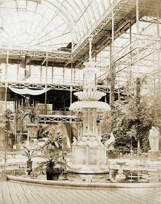
Another example of this strange forwards and backwards straining of modernity is the Infomart building in Dallas, Texas. Completed in 1985, slap bang in the middle of the most horrid phase of Pomo architecture, it is a pastiche of the Crystal Palace. Like much postmodern architecture it combines the cheapness of then-contemporary commercial construction techniques with ‘historic reference’, although in this case rather than generic historical signifiers like keystones or pediments there is actually only one source of reference. As the building is large, square planned and generic, this reference is achieved mostly through the detailing of the curtain wall along the façade, although it features a few small vaulted rooms and a single large atrium that comes complete with a replica of the Crystal Fountain from the CP (made by the same company, Barovier-Toso). The building certainly doesn’t achieve the dizzying internal vistas and rhythms of the original.
But how perfect an example of architecture as a self-legitimising activity! The Informart was built as the ‘world’s first successful technology community’, and is specifically filled with telecoms companies, IT, software companies and so on… Housing an industry that was still very young, and whose future significance was not at all guaranteed, the building uses the Crystal Palace in a ridiculously ideological way:
INFOMART opened in 1985 as a permanent trade center for the information technology industry. Covering 1.6 million square feet, the building was modeled after London’s Crystal Palace, the site of the first World’s Fair, the Great Exhibition of 1851. Like the Crystal Palace, INFOMART Dallas is a stunning landmark whose bold design and elegant seven-story atrium reflect the forward-thinking purpose for which the building was constructed. For this reason, England’s Parliament has declared INFOMART Dallas as the official successor Crystal Palace.
Now, quickly passing over the most obvious error (England doesn’t actually have a parliament, let alone one that would need to judge an ‘official’ successor to the CP), there is another significant fail; much as it is easy to understand the attempt at channelling (conjuring?) the historical power of the first ‘World’s Fair’ building, akin to digging up the bones of a giant so that one can attempt to stand on their shoulders, the Infomart building wasn’t modelled after the Great Exhibition at all. The multiple vaults are rather copies of the ill-fated, sprawling melancholy of the Sydenham Palace of 1854, a building which -despite being constructed from the same iron and glass as its earlier incarnation - was a much more complex and uncertain building than the shed of 1851. This has a historical echo in the fact that the Infomart was for a long time considered a failure, a “a huge silver and white elephant.”
There’s another level to the unintended significance of the Infomart building. It may well have been seen as pretty damn modern at the time, but this was only a couple of years after Beauborg & Lloyds, or Willis Faber Dumas and the HSBC building. The supposedly egalitarian transparency of British Hi-Tech was not yet the all-suitable architecture of choice for commerce that it would later become. In retrospect the Infomart building looks doubly dated- both explicitly historicist and also now deeply unfashionable, part of a stream of design that ran dry. That one of the first physical gestures of the new immaterial landscape of the digital age would be so awkward, so insecure, is perhaps apt.
“If Infomart is a cultural symbol at all, it surely represents high tech’s lack of self-confidence, its ambivalence about the present and the future, and its consequent neet to establish close ties to the past. Infomart’s intriguing façade thus remains merely a façade.”
Howard P. Segal, The Cultural Contradictions of High Tech, in Technology, Pessimism and Postmodernism, 1994
`
Monday, 5 October 2009
Who said romance is dead?
or: Gravissimum est adamare nec politiri.
-Schopenhauer
-Wikipedia
Yunghalm relates that he saw in Java a plain far as the eye could reach entirely covered with skeletons, and took it for a battlefield; they were, however, merely the skeletons of large turtles, five feet long and three feet broad, and the same height, which come this way out of the sea in order to lay their eggs, and are then attacked by wild dogs (Canis rutilans), who with their united strength lay them on their backs, strip off their lower armour, that is, the small shell of the stomach, and so devour them alive. But often then a tiger pounces upon the dogs. Now all this misery repeats itself thousands and thousands of times, year out, year in. For this, then, these turtles are born. For whose guilt must they suffer this torment ? Wherefore the whole scene of horror? To this the only answer is : it is thus that the will to live objectifies itself.
-Schopenhauer
Females lay the eggs in well-protected areas scattered around the reefs. After competing with 2-5 other males, the largest male approaches the female and gently strokes her with his tentacles. At first she may indicate her alarm by flashing a distinct pattern, but the male soon calms her by blowing water at her and jetting gently away. He returns repeatedly until the female accepts him, however the pair may continue this dance or courting for up to an hour. The male then attaches a sticky packet of sperm to the female's body. As he reaches out with the sperm packet, he displays a pulsating pattern. The female places the packet in her seminal receptacle, finds appropriate places to lay her eggs in small clusters, and then dies.
-Wikipedia
Subscribe to:
Posts (Atom)